


The Importance of Signage in Enhancing Community Awareness
A bright exit sign above a doorway often fades into the background after a few visits. The same thing happens with warning boards near roadworks, schools, and shared public buildings. Most people only notice them when they need help fast.
That quiet familiarity is exactly why signage deserves more attention in daily life. Good signs support calm decisions, smoother movement, and safer responses under pressure. When people can read fire safety symbols quickly, they waste less time working out what a space expects from them.
Why Public Signs Shape Daily Behaviour
Signs do more than label doors or point to car parks. They set expectations for how people move, wait, stop, enter, or leave. In a busy community setting, that shared understanding reduces confusion before it grows into a safety issue.
This is easy to spot in places used by many age groups at once. Schools, libraries, sports grounds, high streets, and health centres all bring together people with different routines and levels of local knowledge. Clear signs give everyone the same starting point, even when they have never used the space before.
They also support habits over time. Repeated exposure to the same colours, shapes, and symbols helps people react faster because the message feels familiar. That matters in ordinary moments, but it becomes far more useful when stress levels rise.
Devon has already seen how visible safety messages can shape public response in simple, local ways. In Ilfracombe, a school road project used children’s artwork on eye catching new signs to raise awareness of safe speeds around families and pupils. The point was not decoration alone. The signs helped a daily message stay visible where it counted most.
What Makes Safety Signage Easy To Read
People read signs quickly, often while walking, driving, carrying bags, or thinking about something else. That means clarity comes before detail. A sign has to work at a glance, not after careful study.
The Health and Safety Executive explains that standard safety signs follow a set style and fall into recognised groups, including prohibitory, warning, mandatory, and fire related signs. That consistency helps people recognise meaning across different sites instead of learning a new system each time.
A useful sign usually gets four basics right
- It appears where the decision happens, not several steps too late
- It uses colour and shape in a familiar way
- It stays readable in poor light or from a short distance
- It avoids clutter from extra text or competing notices
When one of those basics slips, people hesitate. A crowded noticeboard, a hidden directional arrow, or a faded fire exit marker can turn a simple choice into a delayed one. In busy shared settings, even small delays can affect how safely people move.
That is why sign design should never be treated as a finishing touch. It belongs in the early planning of any public facing space. The sign is part of how the place works, not just part of how it looks.
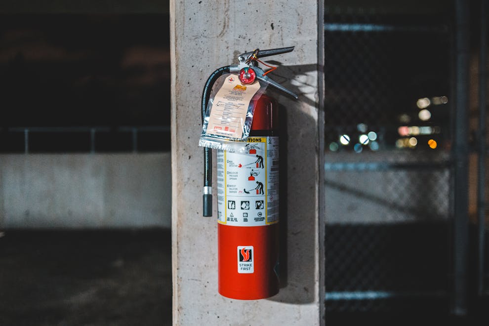
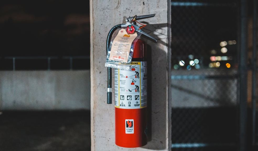
Fire Signs Matter Because Seconds Matter
Fire safety signs carry a different weight from general wayfinding signs. They are there for the moment when people may be rushed, distracted, or frightened. In that setting, a recognisable symbol can cut through panic far better than a long sentence.
The main value of fire signage is speed. People need to identify exits, alarm points, extinguishers, and assembly information without hunting for instructions. That is also why consistency matters so much. If symbols change too much from one place to another, people lose the benefit of quick recognition.
Government guidance for offices and shops makes the wider point clearly. Escape routes must remain usable, direct, and clear, and people should be able to reach total safety quickly if a fire starts. The same guidance also notes that blocked routes and incorrect signage can undermine safe evacuation.
This has a strong local angle for Devon readers because public buildings vary so much across the county. A modern retail unit, a village hall, a school extension, and an older high street property do not share the same layout. Even so, they all depend on signs that people can understand right away.
Good fire signage also supports visitors, not just regular staff. A customer, contractor, parent, or tourist may not know the building layout at all. In an emergency, they rely on visible instructions rather than memory. That is one reason signs should be placed with first time users in mind.
Community Awareness Grows When Messages Stay Visible
Safety awareness rarely comes from one poster or one annual campaign. People remember messages better when they meet them in everyday life, in schools, public buildings, events, and local streets. Signage works well because it stays present without asking for constant attention.
You can see the same pattern in youth safety work. A Devon Daily report on school workshops described how drama based sessions were used to reinforce safety messages for teenagers, helping students absorb and retain advice about personal safety. The setting was different, yet the lesson was similar. Repeated, visible cues help messages stick.
For councils, employers, venue managers, and community groups, that idea carries a practical lesson. Signage works best when it supports wider routines rather than standing alone. A building map helps more when staff also mention escape routes. A warning sign lands better when the area is well maintained and free from mixed messages.
There is also an inclusion point here that often gets missed. Public guidance on fire risk stresses that escape arrangements must work for everyone who may be inside, including disabled people and others with added support needs. Signage is only one part of that picture, but it still plays a real part in helping people find routes, refuges, and exits with less uncertainty.
The most useful approach is often the simplest one. Put the sign where the choice happens. Keep the wording short. Use recognised symbols. Check that nothing blocks the view. Then review it from the position of someone visiting for the first time, because that is often the best test of whether the message is clear enough.