


Marjon launches new corporate branding
The University of St Mark & St John (Marjon) has introduced its new corporate brand identity. The significant rebranding project follows the recent award of the full university title to the former university college and represents a major milestone in the institution’s near 175-year history.
The new brand, unveiled to around 400 university staff and members of the Board of Governors, reflects the combination of the University’s unique heritage and its strategic direction in pursuit of excellence in its four specialisms of: Education; Journalism and Creative Arts; Language and Linguistics; and Sport. The university’s specialisms build on its established record of academic excellence and respond to the employability agenda.
Professor Cara Aitchison, who took up post as the University’s first Vice-Chancellor on 1 May said, “The recent award of university title recognises our heritage, our continuing reputation for delivering an outstanding student experience and our relevance to 21st century employability in professions that make key contributions to the economy and society. “University designation also emphasises the increasing diversity of UK universities and recognition that smaller universities like St Mark & St John will play a greater role in delivering high quality specialist education that responds both to student demand and employers’ needs. “The new University identity will enable us to be more easily recognised across higher education where the identity of the university college was a little ambiguous. The University of St Mark & St John has very significant strengths that attracted me to move from the University of Edinburgh. The new brand identity and accompanying activities to launch the University will help us communicate these strengths more effectively to our stakeholders.”
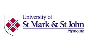
Head of Marketing & Communications, Kerryanne Delbridge said, “After working on a number of possible concepts, we formulated a three-quarter shield design for our logo, which provides a modern twist to the original crest. For the typeface of the University we chose a traditional serif font to reflect our legacy and to align with our original crest which remains the anchor of our brand and which will continue to be used in full for ceremonial occasions.
“The four ‘dark red’ coloured diamond-shaped representations in the new logo form the central tenets of the brand identity. The diamonds, which are taken from the crest, represent new life and culture. The diamonds are separated by a modern representation of the crossed swords taken from the crest and which also aligns with the cross separating the four castles on Plymouth City’s coat of arms.
“In addition to the main identity, we have included four sub-identities, to clearly position the University as a ‘first choice provider’ for the four specialist areas we excel in.”
Newly appointed Alumni Development and Events Officer, Alison Wall said, “The University of St Mark & St John is set to unveil the new brand with a formal celebratory launch, and a joint celebration marking ‘40 years in Plymouth’ on Tuesday 1 October 2013. This is timed for the arrival of new students and the first cohort who will graduate having undertaken their degree at the University of St Mark & St John”.
Register now to visit the next Open Day on 25 June 2013 or register to attend the 1 October major launch event.


 receives MAT Excellence Award for IMP Software.")